
THIẾT KẾ TỜ RƠI QUẢNG CÁO
[
[
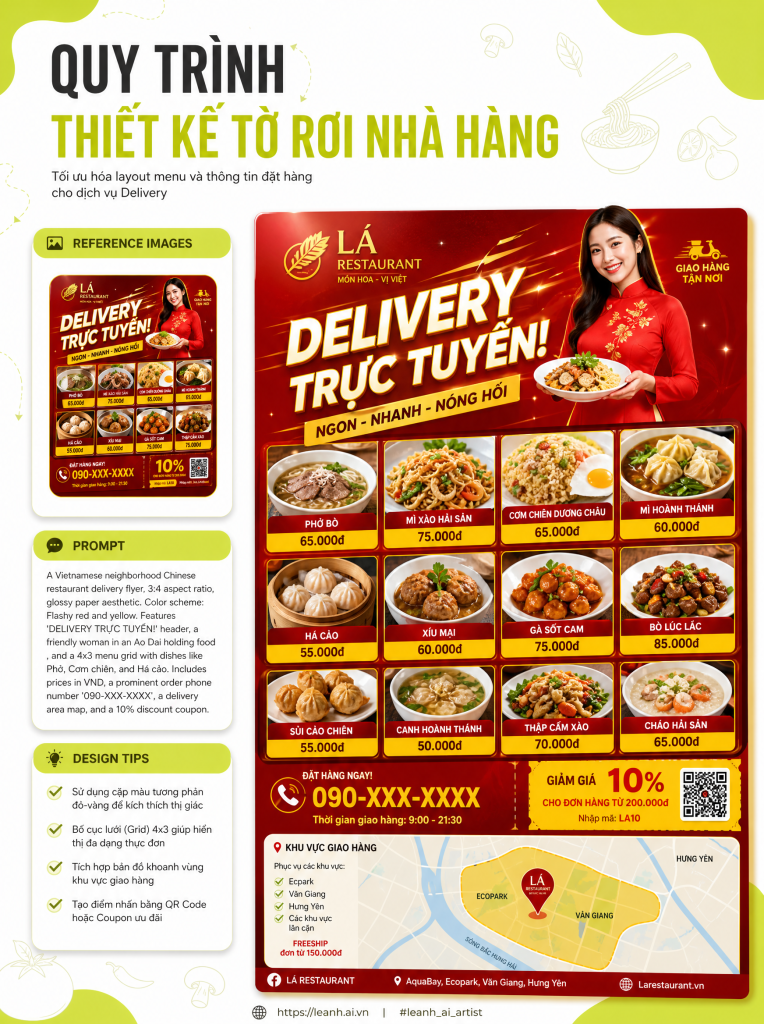
[A Vietnamese neighborhood Chinese restaurant delivery flyer for mailbox posting (3:4 aspect ratio). Designed to look like a double-sided B5 print, typical of cheap, glossy paper printing.
Flyer Characteristics:
Color Scheme: Flashy red and yellow.
Large Text at the Top: “DELIVERY TRỰC TUYẾN! {argument name=”shop name” default=”Mona-Hanten”}” (shouted Gothic font with shadow).
Illustration: A friendly Vietnamese person (maybe a woman in an ao dai or a cartoon character) smiling and holding a delivery box or a bowl of food, with a speech bubble saying: “Sẵn sàng phục vụ!”.
Menu Photo Grid (4×3): Various Vietnamese-adapted Chinese dishes: Phở (Chinese style), Miến trộn (Chinese style), Cá kho tộ, Cơm chiên Dương Châu, Chả giò, Bánh bao, Thịt heo kho tộ, Mì xào giòn, Há cảo, Đậu hũ sốt Tứ Xuyên, v.v. (Including Vietnamese names and realistic photos of dishes).
Names and Prices: Small text below each photo with the dish name and price in VND (e.g., “Phở Xào Tàu: 65,000 VND”).
Large Yellow Banner: “Miễn phí giao hàng cho đơn hàng trên 200,000 VND!”.
“Order by Phone!”: A prominent red circle containing “ĐẶT HÀNG NGAY! ☎ 090-XXX-XXXX” (using Vietnamese number format).
Business Hours: “Giờ mở cửa: 11:00-22:00 (Nghỉ thứ Ba)”.
Delivery Area Map: A simple schematic map showing the local neighborhood and delivery area.
Coupon: (Perforated line for clipping) “GIẢM GIÁ 10% VỚI TỜ RƠI NÀY!”.
Footer: Small text: “{argument name=”shop name” default=”Mona-Hanten”} – {argument name=”address” default=”123 Đường Tên shop, Quận Tên quận, Thành phố Tên thành phố”}”.
Style:
Real-life delivery flyer aesthetic.
Focus on food photography and bold text.
Includes slight fold marks for a realistic look.
High detail to make it look like a real Vietnamese delivery flyer.
Notes for Image Generation:
Ensure the Vietnamese text is correct and natural.
The food photography should look appetizing but like it’s from a real restaurant.
The overall layout should be typical of a mass-produced flyer.]
]
]